
The Importance Of Good Design In Video Games: The World of UX/UI
The Importance Of Good Design In Video Games: The World of UX/UI
When you think of making a game, the typical ideas that come to mind are programming, art, and story. But what people often miss is the design portion of the development process. The game needs to be fun for the player. This may seem obvious, but the world of User Experience (UX) and User Interface (UI) is hard to navigate and takes time to get right. From menus that help the player navigate through the game to heads-up displays (HUDs) that show the player what they need to pay attention to while playing, displaying information is a pivotal part of video game development that can make or break a game.
First, let me show you what a good design looks like. These are games that took their time developing what they need to show the player. Creating an easy, user-friendly, way of showing the player what they need to know at any given moment when playing.

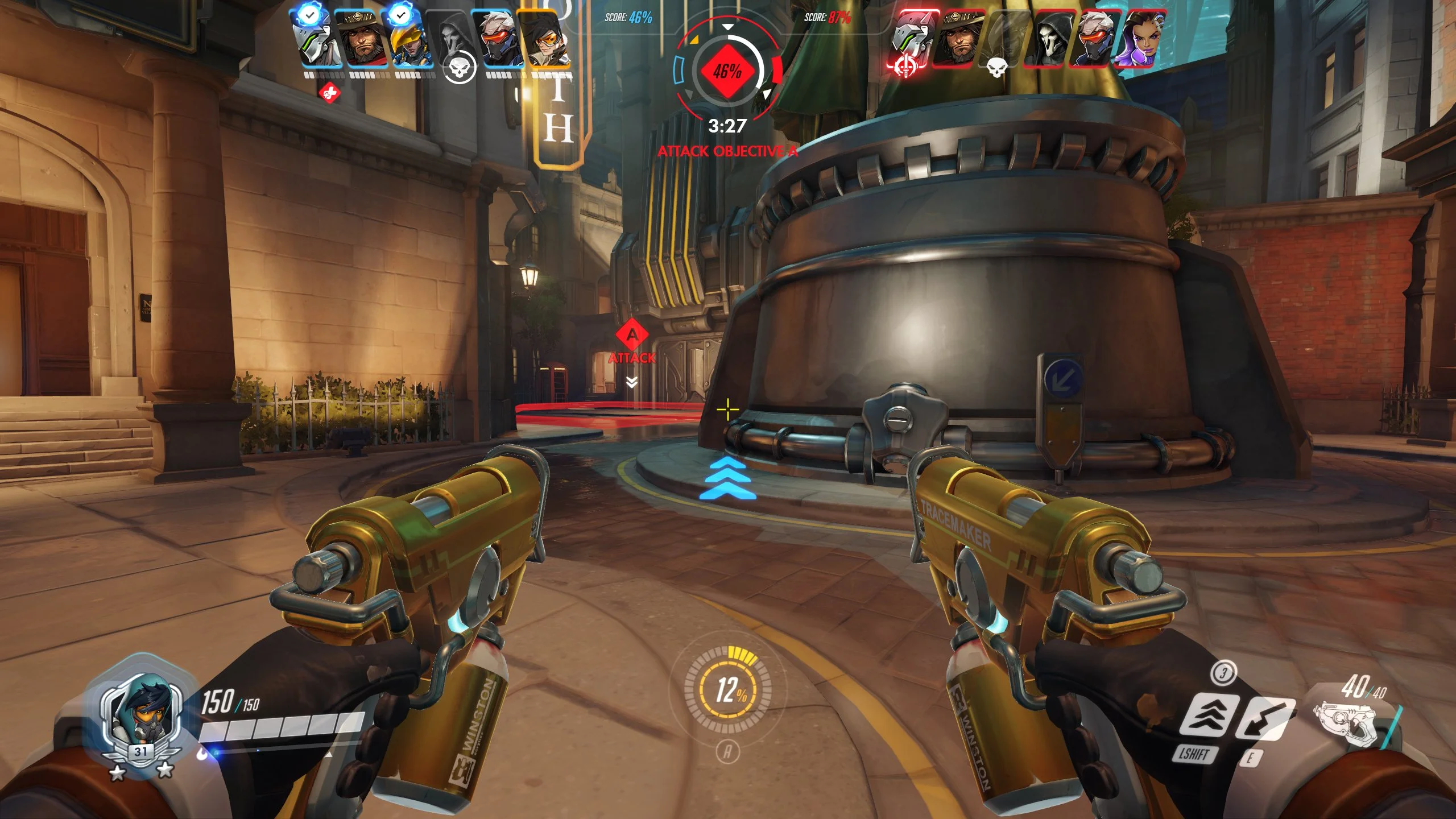
Overwatch is a prime example of a good HUD that doesn’t overwhelm players with information. When playing Overwatch there are only a handful of critical things that need to be readily referenced when playing: Health (bottom left), Abilities (bottom right), your Ultimate (bottom center), and the current Objective (top center). By having these strategically placed at the edges of your screen you have lots of free space in the middle for your player to see what’s going on while also having the ability to quickly dart their eyes to these critical things at a moment’s notice. Not only is the placement a great design feature, but the use of color is also another excellent example.
The use of red for enemy objectives and highlighting around the players triggers the player to pay attention to them more. The use of yellow for your ultimate is another eye-catching color, making it easier to quickly reference in the heat of battle. As well as the use of having more of the UI be see-through makes it not overly distracting when playing. Having it blend in with the environment just a little makes it not stand out when you are focused on playing the game at high speeds.
Now let me show you an example of a poorly designed UI from the sequel, Overwatch 2.

This here shows the ultimate indicator from Overwatch and Overwatch 2. Very little has changed between the two, but by looking more closely you realize that the efforts to simplify their UI ultimately (no pun intended) lead to a worse design. To begin let’s talk about the color change, in Overwatch the highlight color in the game was yellow. Including that into the UI fit nicely within the context of the HUD. In Overwatch 2 they changed that color to orange, which meant changing the HUD feature. Making the quickly noticeable yellow indicator now a bland darker orange.
Next, would be the design of the outer circle, in the first game, it was more like a dial being filled, with the small gray areas popping out slowly when the circle fills up. In the second game, they shot for a more simplistic design by just having a circle with nothing changing inside of it other than the orange bar going around.
Finally, the text inside of the circle, in the first game displayed the percentage by showing you in big font the number and then a “%” next to it. In the second game, they kept the font but took away the “%”. For old players, this may seem OK because they would already know what the bar was for. But for new plays who have played Overwatch, they might confuse it for another feature in the game.
This is just one game where the line between good and bad design can be easily crossed with simple changes. It’s important to have these thoughts in the front of your mind when making games so you can make the experience of the player more enjoyable. So next time you’re playing a game, pay attention to how it’s laid out. Do you know what’s important to pay attention to? Or what to push when something happens?